Design directions for Capreece Bowers
Three directions for the top of the homepage, using your updated bio, your practice and the two November workshops. Once one is chosen, the full site gets built out in that style.
Have a look at each on your phone as well as your computer.
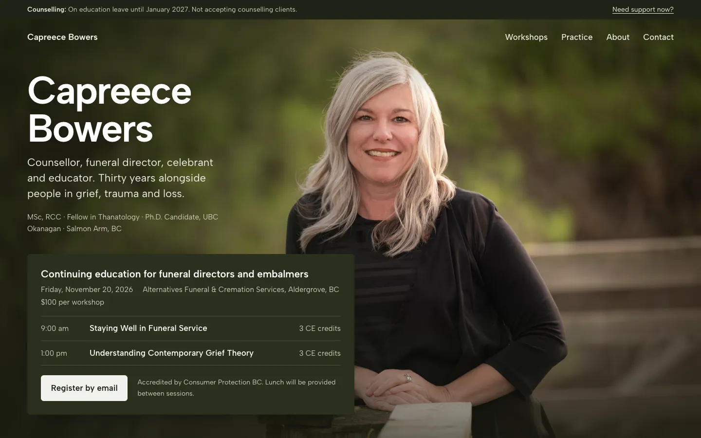
Shuswap light
Photo-led and warm. Your boardwalk portrait fills the top of the page, with colours taken from the photo itself.
Leads with: You, then the November 20 workshops with everything needed to register.
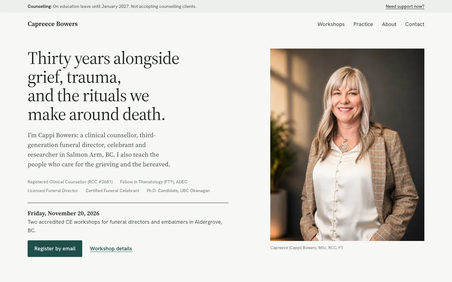
Quiet editorial
Calm and typographic. One clear sentence about what connects your work, your portrait beside it, and plenty of white space.
Leads with: What ties your work together, then the workshops as a clear dated list.
Education first
Modelled on how First Responder Health presents its courses. Leads with what you teach, with the course facts set out plainly and you as the instructor.
Leads with: The workshops: dates, place, credits and cost, then you as the person teaching them.